Happy New Season/Academic Year

Here we are...the beginning of another academic year/season. I know I've let this blog languish, but that was due to lack of time/energy not lack of content.  Last season was hell on wheels. Anytime that you are doing a lot of 8am to 1am shifts, is not a good time. I had written many a post in my head while my hands are busy with a brush. (Still haven't figured how to download from brain to the laptop)
The whole season got away from all of us and for the first time in my employment here, I wanted to quit. Disability doesn't pay enough, so I stuck it out. My break wasn't spent doing work for other theatres or getting ahead on Nutcracker. I did home projects, played with my kids, and even went on a vacation (!!!!). The only work I picked up was some interior painting for a new professor, which was really quite lovely.

I started back here on Aug 10th with a new mindset and a new timesheet system to fight with. (Nearly two weeks in and I've only had to call IT once.) There wasn't much to blog about yet, (how much cleaning do you want to hear about) so I held off. And now I am starting to fling some paint around. I intend to catch up on all the shows since I stopped posting because there are some really fun and beautiful things I worked on. I am still pondering the best way to keep my posts more regular. Having a smartphone will help, (Yes, I finally got my Big Girl phone).

The coming season holds some interesting challenges for us. We are deviating a little from the standard schedule to accomodate the (very large) first show.
Here is what I will be working on:

*Mainstages are fully produced (sets, costumes, etc...and the designers required for all that) with a (paltry) budget. Black boxes have no budget and pull costumes and props (and occasional set pieces) from our stock. Depending on time and how generous my boss is feeling.
Main stages:
The Life and Adventures of Nicholas Nickleby (yes the 8 1/2 hour version)
Titanic
Arcadia


 Black Boxes:
Small Town Story
Robber Bridegroom
Metamorphosis
Reefer Madness
Much Ado About Nothing

As you can see, we will have our hands full. More later...my drop is dry enough for the next step.

Snow in July?

Sometimes the themes of drops and other scenic projects coincide with similar themes in your life in a perfect moment of Kismet. And sometimes not so much. I'm unsure what category to place my current project.


A snowy forest in July. It's a tad hard to get the feel of snow when the temperatures outside are 90° and beyond. But then again, when you are knee deep in snow, do you really want to spend your day staring at more snow? I'm leaning towards the drops as a nice little vacation from the heat. Kind of like the old York Peppermint Patty commercials.

This wintery wonderland is for our Community Dance Division's production of The Nutcracker. The last several years they have been renting drops for the show. Because of the cost this means the drops are rented for the shortest amount of time possible which creates problems because it limits load-in and rehearsal. The department has (finally) decided to make the investment and have it's own set built. And guess who was somehow convinced to design it? Yep. Me.

So that big ball of crazy above is my own fault. But that also means I can tweak things as I need to along the way. It also makes the process much easier because the full design will be built over several years. A few drops this year. A few more the next. My being on staff means I'm around to deal with things over the course of the project. Another designer might not be available when we get to some elements in a year or two.

And that is what I am currently up against.

Normally this time of year I am off contract and not working for the University. Which is usually ok (minus the lack of paychecks) since our shop isn't air conditioned. Multiple Sclerosis and heat are not a happy mix. With the back to back heat waves that have become the summer trend, I could easily end up in the hospital. Luckily for me, my husband has a paint shop not in use at the moment. A paint shop that is larger and climate controlled. A very nice thing.

With my own paint deck I would only be able to lay out the larger drop above. The two side legs would then have to be painted after that was finished. Now I am able to lay out everything all at once, which greatly helps in keeping a consistent look amongst the drops.

Here is what it looks like all laid out in the shop.


  The drops are on black plastic. Typically I would use bogus paper underneath the drops, but since I am using a flexible glue sizing I have to switch to plastic. Apparently the paper and the glue size don't play nice. The reason I've switched to a flexible size is that these drops will be used year after year and folded up and stored in between shows.

I ran short of gridded paper, therefore I had to use a string grid and draw directly on the legs.  Here is a closer shot of the string grid and the rendering.


The finished layout below. 


The larger drop I used gridded paper for the major layout. This allowed me to adjust the drawing and make some mistakes without it ruining everything.


 There we are...laid out, inked, and with a thin white base.


For this drop I'm not drawing out every single line of every single branch. My drawings are just giving me the location of general shapes.  I'm not doing paint-by-number accuracy for these. To non-Scenics, most of these lines make no sense to them.


 That was made very apparent to me by the questions my husband was asking while I was inking the layout.


 Then it was time to start laying in color...after the mandatory prayer to the Painting Gods. (Please don't let me fuck this up).

Working background first, I start laying in the color of the beautiful pinky-violet glow. First a general spray.


 Then with more intensity.


And that's where I had to stop because I ran out of paint.

*sigh*

These pictures look far more violet than the actual drops. Until here is the drop versus the rendering.


My paint should arrive on Monday. That will give me some time to finish designing the rest of the show.

It's a circus in here

Last few weeks have been lacking in content and Friday Flashbacks, but I've not been idle. If anything I've been busier than ever. Even without a shop full of scenery, I've had my hands full getting Little Dude ready for Kindergarten.

Meanwhile in the shop I've been tackling our big musical for the fall, Barnum, or as I like to call it, 'Holy crap, that's a lot of soft goods!'

This show is filled with drops, banners, swags, and painted fabric galore. There's also a few hard scenery pieces (doors, circus plinths, poles, pedestals, rolling units, and a staircase of  building) to keep me busy as well. Oh and there's the elephant....or rather the lower half of one. (you will see).

So let's get you caught up, shall we?

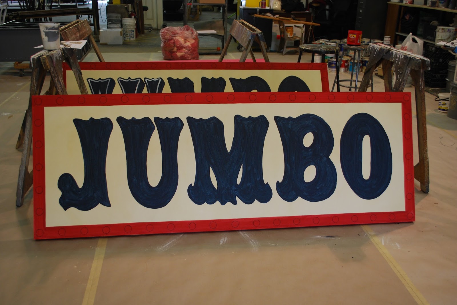
The first project I was able to start was the Jumbo signs.These were the only things I had muslin on hand for. Stretched over frames like a canvas, the muslin was then sized, based and the layout drawn on it.


The inked letters ready to paint.


In progress. You can see the white being added to the lettering on the back one.


Nearly done.


And done. I really like how these came out. It was a nice start to the show.


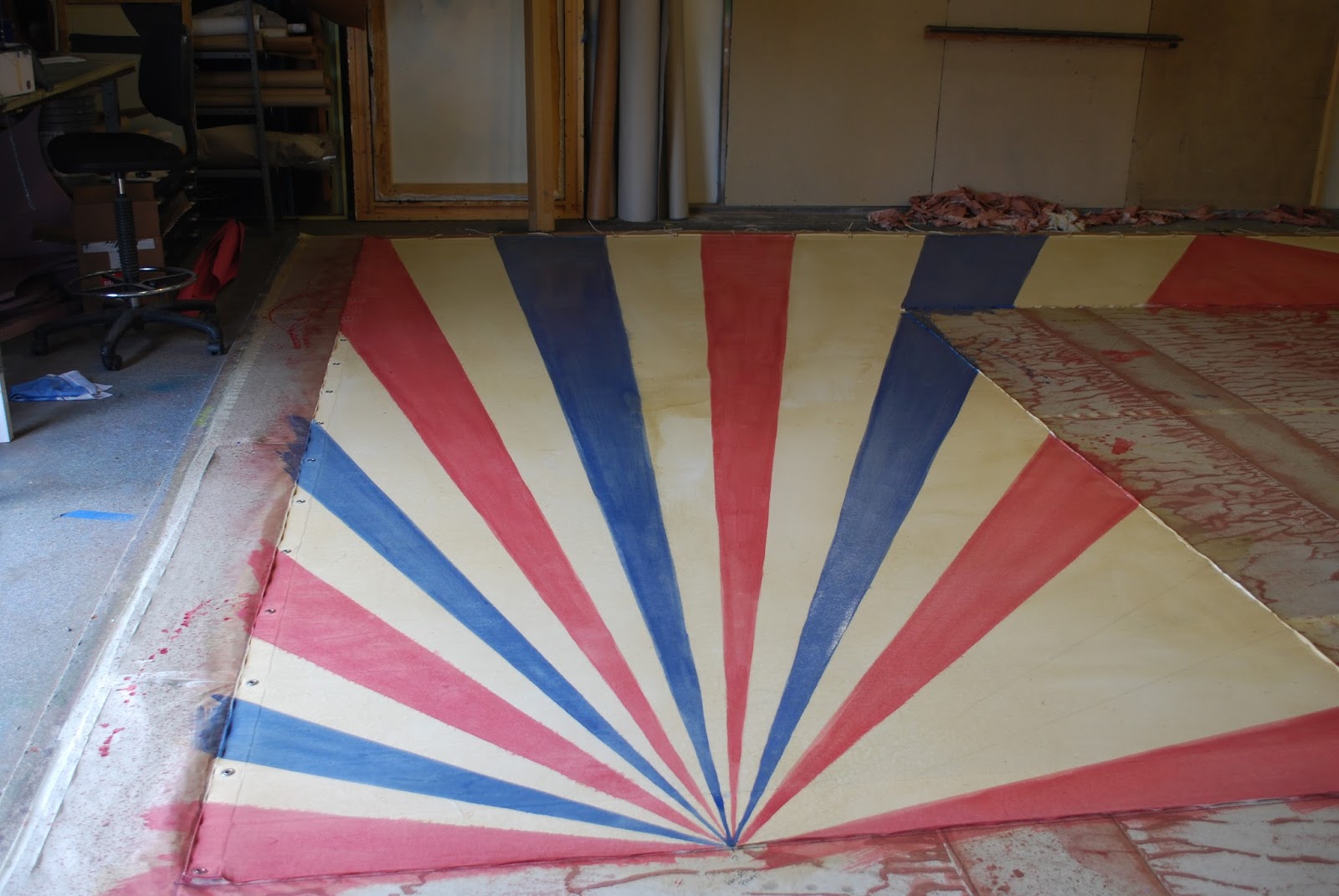
 While working on the above signs, the muslin order came in and I started on the rest of the soft goods. The side walls have striped swagged curtains, reminiscent of a circus tent. The longer pieces are for those. The shorter piece farther on is for the remaining banners.


And behold the magic of starch.


I seem to have forgotten the camera on the day I completed the 'white' stripes and the banners.  Pulled up the 'white' ones and started on the red. Starched and painted.

These were then pulled up and sewn together. Now the await flame proofing and the the finishing decorative swag detail.

Time for the portal drop. From the box...

squared and stapled down...

Again the camera was lacking on the day I starched, drew the layout, and based the striped portal drop.This is what it will look liked in space. The gold arches are going to be hard pieces that the fabric will be attached to. The top and sides are tied off to poles. Across the top will be flags and swags and lots of showy goodness.

Here's the red stripes. I labeled the heck out of these things. I was terrified of painting the wrong color in the wrong place.


Then the blue stripes.


And done. We have a lot more fabric around the opening area than truly needed, just to be safe.


The extra fabric in the opening is for the Tom Thumb banner, which has a similar background. 
 
 
In addition to all of those soft-goods, I've been tackeling a bunch of the hard scenery.


 After this lot, I've dubbed the show Holy Soft-goods and Geometry.  In this picture you can see how we recycle our materials. The back of the piano looks like a bunch of spooky trees because it formerly was apart of this:


That is one reason I go through a lot of primer. 

Here is the lovely diamond pattern that wraps around the wagon edge. Strangely enough the pattern pretty much worked out even. There was a little tweaking on the short end, but not enough to look to horrible.


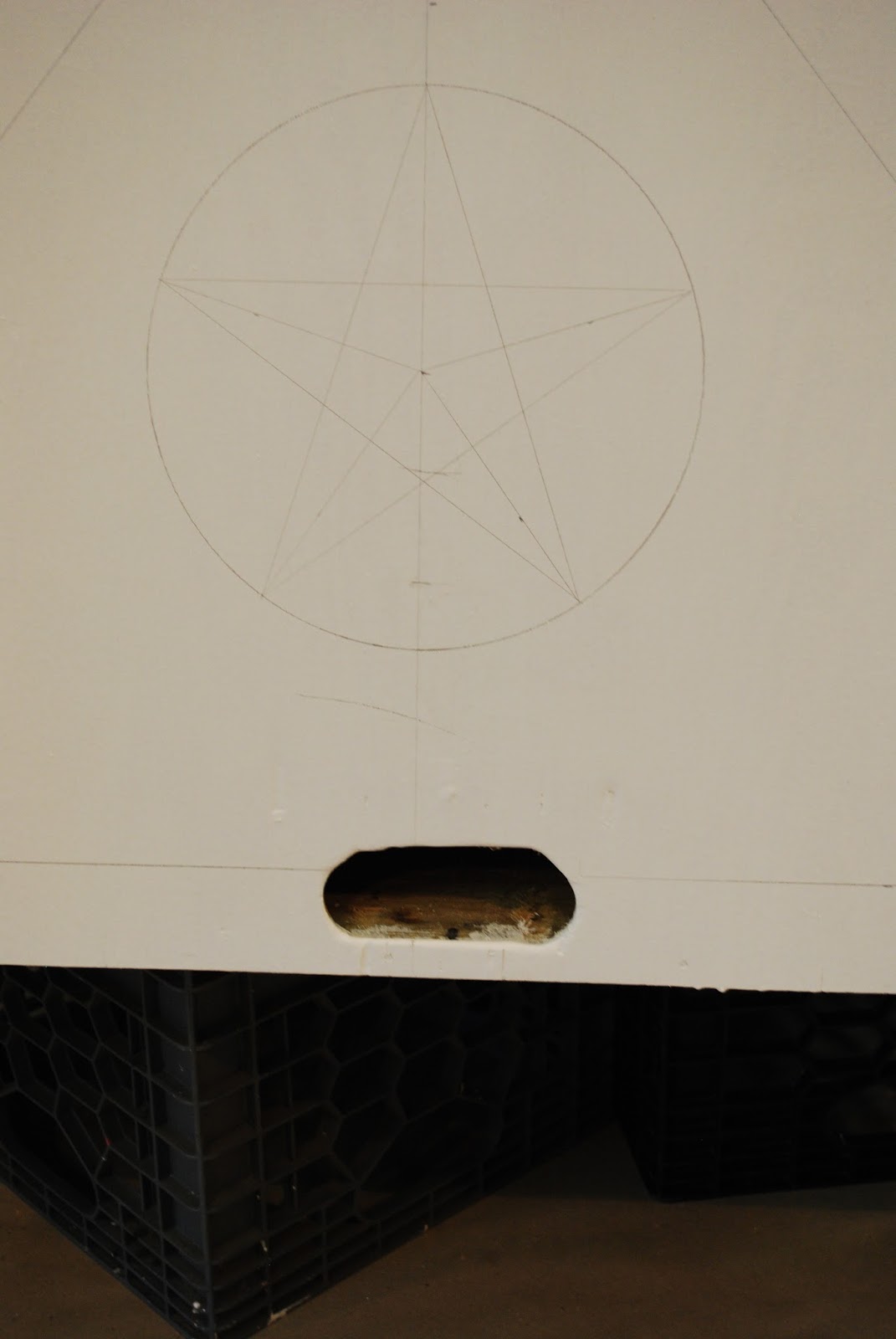
The plinths offered a few layout challenges. The finished pieces are different sizes from the draftings. The sizes changed due to instructions from the director and pieces we already owned. So I had to tweak measurements a little bit. I went old school geometry on the stars with a protractor and some trammel points.


After all the pencil layout, I inked the lines I needed for painting. Then I rolled another coat of primer. This will cover the pencil lines but leave the Sharpie still visible enough to use as a guide.


I had a bid more trouble with the circular plinths. I figured to do the layout I'd need a vertical line on these pieces. But you might notice that the bases are not straight cylinders but tapered like cones. This posed a problem for getting an accurate line. That's where the miracle of the laser level comes in. Gave me a perfect vertical line to start from. From there I measured around and kept dividing until I had enough points. As you can see from the front plinth I ended up needing to add more to get the right look, hence the black lines and red lines. I took a different approach on the second one. I couldn't just transfer the measurements because they were different sizes.  I wrapped around a thin strip of paper and cut to size. Then I just kept folding and marking to divide it evenly.and then used it as a ruler to mark points. Much easier. I couldn't
 

Then some blue tape and I (finally got to painting).


The best advice with the blue tape is to remove it as soon are you are painting. If you let it dry you run the risk of pulling off what you just painted.


And that's as far as I got...Little Dude fell ill and I had to switch into Mom mode. 


Now you are caught up on Barnum. Next week will start off with finishing the plinths and the wagon, flameproofing the soft-goods and tweaking a previously painted scrim.

Flashback Friday

Today I'm going to take us on a short journey back into September of last year.  And a simple main-stage production of Antigone. Being performed in the round (meaning the audience is surrounding the stage on all sides) meant that were not a lot of big scenery requirements. Therefore a set designer wasn't hired for this production. The director had something in mind and gave me a rough sketch....which I can't seem to find. It was a rough outline of a bearded face with bleeding eyes. (I'll add a pic if I happen across it)
He wanted the audience to walk in and see this face there on the floor that had a 'stone like' look to it and the words around the outside. So I did a little work in Photoshop and sent this back to him as a more refined design.


He loved it and I actually began painting it before the end of my contract the summer before; finishing the base look of the floor.  Upon returning I started in on the head and the lettering.


The director had expressed a wish that he would like the face to glow under the lights and have that effect fade in and out. I brought up the black light reactive paints and we had a plan. I even found paint that would glow red for the blood coming from the eyes.


When the director came to see the finished floor, he was positively giddy. Unfortunately in space there were some issues with getting the same results from the lighting designer's equipment.  Mostly because the lighting designer made a lot of false assumptions on what would work. I ended up throwing another coat of the UV paint on right before opening (and missing Stitches East). Either way I think the end result was rather stunning. 

P1015939

P1016034

P1016066

P1016016


P1016049

Flashback Friday


I promised flashbacks and here is your first one. I was going to begin with the show I had abruptly stopped with, but I have a recent project that is more near and dear to my heart.

We have these 'deteriorating' columns. They have never been used in a show since I have been here, but we rent them out. A lot. Which is amazing because they look like this:


Now these embody many of my painting pet peeves. The first is bad marble in general. It irks me. I strive to make my marble realistic. Whenever I come across actual marble I become mesmerized in trying to figure out how I would recreate it with paint. This has, more than once, led to me walking into walls or tripping over something/someone. The second is the purple 'fantasy' marble. Designers love this sort of thing for some reason. Marble doesn't exist in those colors, but you paint what you are told. However that is no excuse for the 'pooka-pooka' sponge marks on the marble. I should not be able to see each and every spot you plunk down your sponge. And frankly, if it is marble, I should not be able to see that you used a sponge at all. Then the veining. Oh vey, they veining! No, no and NO! Someday I'll do a post regarding this....too much to include here.

I've seen these things go in and out of our shop on rentals and they make my twitchy every time I see them. When a few of them returned from a end of year event and I had some unoccupied time before the end of my contract I saw my chance. I approached my boss with the proposal of repainting them to look better and make them more attractive for rental and use on stage (read- not purple). Don't get me wrong. I love purple, but a more realistic and neutral color would be more versatile for rentals and productions. He thought it was a great idea and said go for it.

And I did.

The first step was to kill the purple. It took two coats of primer and two coats of  the base color. I don't care what the manufactuaer says; their purple (and some blues and pinks) have dye in them. It can create havoc in other situations, but in this one it just made it hard to cover.


The new marble choices were a creamy brown for the top and keep the black on the bottom. These were my inspiration samples.


Once I had the base set, the glazing of colors began. 


This picture shows a good example of the difference between the base coat and the glazes.


Another example of the differences in the process. The one on the right is the first layer of glazes. The one on the left is a few steps further in the process. 


 This one I was rather happy with. Much prettier than the purple.


With the glazes done it was time to start veining. This was the hardest and most stressful part. I really obsessed over making them look realistic. On a table top or a section of wall it is much easier than on a item you can see from 360 degrees. I tweaked it in some spots but really worked to make it seem like these were cylinders of real marble.


I liked these two sections.


Then onto the bases an the portoro marble. I worked them as if each face was a different slab of marble applied to the base structure. 


The linear nature of this marble felt so very strange to me, but it was fun to do. I'd never painted this type before. 


And here is the whole lot. Big improvement, no? Much classier and more likely to be used on stage as well as for events. I'm rather proud of them. There are areas I'm still not happy with but overall I think they are a tremendous improvement. And it was far more fun than just cleaning the shop.


Here are a few more individual shots.


I hope my first Friday Flashback didn't disappoint.